
The era of playing it safe with beige and gray is coming to an end. As we move through 2025, interior design is embracing bold expressions of personality through color and innovative painting techniques. Homeowners are discovering that paint offers the most dramatic transformation for the smallest investment, allowing them to create spaces that truly reflect their individual style while staying current with evolving design trends.
The Color Revolution: Why Bold is Back
After years of neutral dominance in home design, there's a noticeable shift toward more expressive, emotionally resonant color choices. This change reflects our deeper understanding of how color affects mood, productivity, and overall well-being. Research in environmental psychology shows that carefully chosen colors can reduce stress, increase creativity, and even improve sleep quality.
Warm terracotta tones create an inviting, sophisticated dining atmosphere
The move away from neutrals doesn't mean abandoning sophistication. Instead, it's about finding the right balance between personal expression and timeless appeal. Today's color trends focus on creating depth, warmth, and visual interest while maintaining the flexibility to evolve with changing tastes and lifestyles.
Leading Color Trends for 2025
Warm Earth Tones with Modern Sophistication
The Palette: Terracotta, Sage Green, and Warm Clay
These grounding colors bring nature indoors while offering the warmth that many homeowners crave. Unlike the cool grays that dominated the past decade, these earth tones create spaces that feel nurturing and alive. Terracotta works beautifully in dining rooms and kitchens, while sage green creates calming bedroom retreats.
The key to working with earth tones lies in understanding their undertones and pairing them with complementary neutrals. Cream, warm white, and natural wood tones provide the perfect backdrop for these richer colors to shine without overwhelming the space.

Sage green creates a serene, spa-like atmosphere in bedrooms
Jewel Tones That Command Attention
Deep emerald greens, rich sapphire blues, and luxurious burgundy are making statements in 2025. These colors work particularly well as accent walls or in smaller spaces like powder rooms, where their dramatic impact can be fully appreciated without becoming overwhelming.
The Power of the Accent Wall
Strategic use of bold color on a single wall creates focal points that draw the eye and define spaces within open floor plans. This technique allows homeowners to experiment with trending colors without committing to painting entire rooms.
When incorporating jewel tones, consider the room's natural light and intended function. North-facing rooms benefit from warmer jewel tones like burgundy or deep amber, while south-facing spaces can handle cooler emeralds and sapphires without feeling cold.
Unexpected Neutrals: The New Foundations
While moving beyond traditional neutrals, 2025 introduces sophisticated alternatives that provide the same versatility with more personality. Mushroom grays with warm undertones, creamy off-whites with hints of peach, and soft lavender-grays offer neutral functionality with subtle character.

Warm mushroom gray provides a sophisticated neutral backdrop
Beyond Solid Colors: Pattern and Texture Trends
Geometric Patterns Making a Statement
Hand-painted geometric patterns are replacing wallpaper in many homes, offering custom designs that perfectly fit the space. From subtle tone-on-tone chevrons to bold color-blocked diamonds, these patterns add visual interest without the permanence or expense of wallpaper.
Vertical Stripes
Create the illusion of height in rooms with low ceilings. Use colors within the same family for subtle sophistication, or contrast bold colors for dramatic impact.
Color Blocking
Define different areas within open spaces using geometric color blocks. This technique works particularly well in children's rooms and creative spaces.
Ombre Effects
Gradual color transitions create depth and movement on walls. This technique requires more skill but delivers stunning, artistic results.
Textural Painting Techniques
Advanced painting techniques are gaining popularity as homeowners seek unique, artisanal finishes that can't be replicated with wallpaper or other wall treatments. These techniques add depth and visual interest while showcasing craftsmanship.

Textured paint finishes add depth and sophistication to wall surfaces
Room-by-Room Color Strategies
Living Spaces: Creating Warmth and Connection
Main living areas benefit from colors that encourage gathering and conversation. Warm earth tones, soft corals, and muted jewel tones create inviting atmospheres that work well for both daily family life and entertaining guests.
Consider the room's orientation and natural light when selecting colors. East-facing rooms that receive morning light can handle cooler colors, while west-facing spaces that get warm afternoon light benefit from cooler tones to balance the natural warmth.
Bedrooms: Personal Retreats
Bedroom color choices should prioritize relaxation and personal preference. Soft, muted versions of trending colors work well, such as dusty rose instead of bright coral, or sage green rather than vibrant emerald.
Remember that bedroom colors should make you feel calm and comfortable, regardless of current trends. Your personal color preferences are more important than following fashion in these intimate spaces.
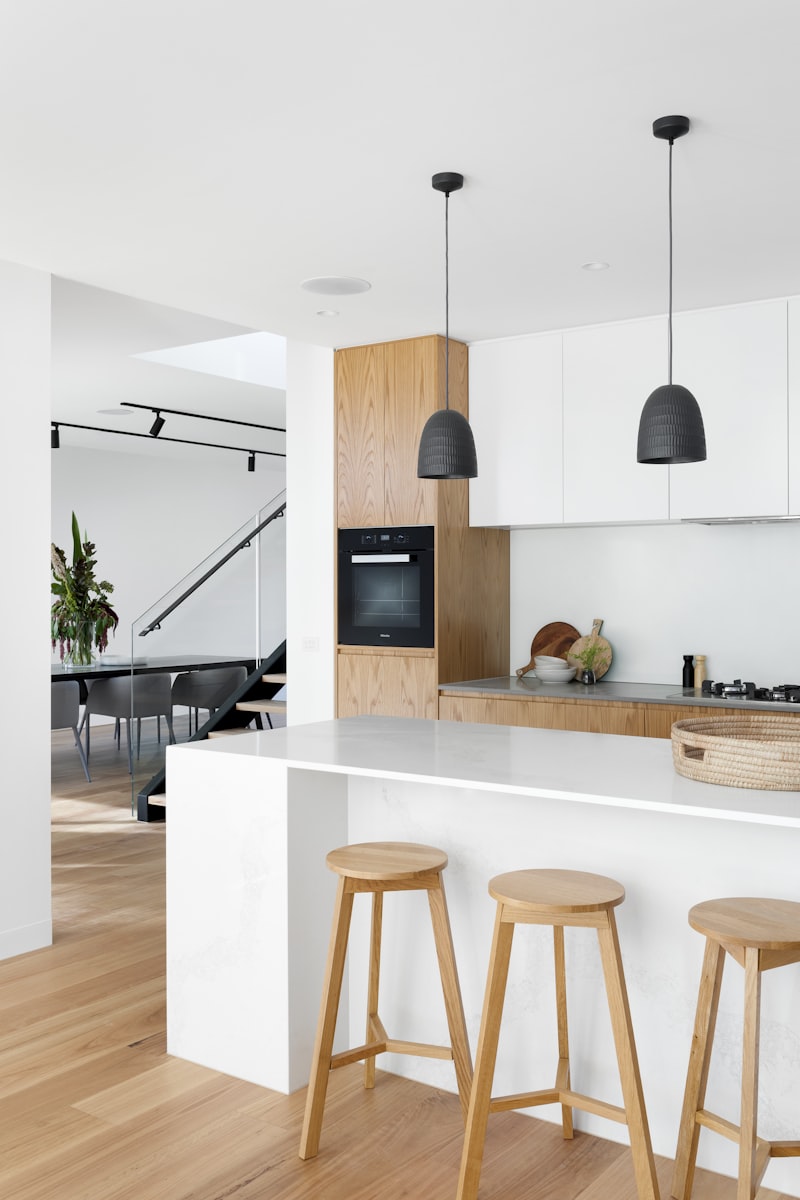
Kitchens: Balancing Function and Style
Kitchen color choices must consider both aesthetic appeal and practical concerns. Colors that hide minor imperfections and stains while maintaining visual appeal include warm whites, soft grays with warm undertones, and muted earth tones.

Warm whites paired with terracotta accents create a timeless kitchen palette
Practical Implementation: Making Bold Choices Work
Testing Colors in Your Space
Before committing to any color, test it in your specific lighting conditions and space. Paint large swatches directly on the wall and observe them at different times of day. Colors can appear dramatically different under various lighting conditions, and what looks perfect in the paint store may not work in your home.
Consider purchasing sample sizes and painting poster board pieces that you can move around the room. This allows you to see how the color interacts with your furniture, flooring, and other fixed elements.
Balancing Bold Choices with Flexibility
When incorporating trending colors, consider their longevity and your ability to refresh the space easily. Bold accent walls can be repainted more easily than entire rooms, and accessories in trending colors allow for updates without major renovation.
Plan Your Color Transformation
Calculate your paint needs and budget for your color makeover:
Working with Existing Elements
Coordinating with Fixed Features
Successful color schemes work harmoniously with elements you can't easily change, such as flooring, countertops, and built-in fixtures. Identify the undertones in these fixed elements and choose colors that complement rather than fight against them.
If you have cool-toned granite countertops, warm paint colors might create visual discord. Instead, consider cooler earth tones or colors with similar undertones that create a cohesive look.
Creating Flow Between Spaces
While each room can have its own personality, maintain visual flow throughout your home by repeating color elements or using colors from the same family. This creates cohesion while allowing for individual room character.

Coordinated color palettes create flow in open floor plans
Maintenance and Longevity Considerations
Choosing Quality Paint for Lasting Results
Bold colors and specialty finishes require high-quality paint for best results and longevity. Premium paints offer better coverage, more accurate color representation, and superior durability, especially important when using trending colors that may be harder to match for touch-ups.
Consider the room's use when selecting paint finish. High-traffic areas benefit from more durable finishes like satin or semi-gloss, while bedrooms can use flat or eggshell finishes for a softer appearance.
Planning for Future Updates
Color trends evolve, and your preferences may change over time. Choose colors you genuinely love rather than following trends blindly, and consider how easily you can update the space when you're ready for a change.
The Psychology of Color in Home Design
Understanding how colors affect mood and behavior can guide your choices beyond aesthetic preferences. Warm colors like reds, oranges, and yellows tend to energize and stimulate conversation, making them ideal for social spaces. Cool colors like blues and greens promote calm and focus, working well in bedrooms and studies.
However, personal associations and cultural background also influence color perception. Choose colors that resonate with your experiences and make you feel comfortable in your space.
Sustainable Color Choices
Consider the environmental impact of your color choices by selecting low-VOC or zero-VOC paints that contribute to better indoor air quality. Many premium paint brands now offer extensive color ranges in environmentally friendly formulations that don't compromise on quality or durability.
Timeless color choices also support sustainability by reducing the frequency of repainting. While trendy colors can be fun, choosing colors you'll love for years reduces waste and saves money over time.
Looking Beyond 2025
While following current trends can refresh your space, the best color choices are those that reflect your personality and lifestyle. Use trends as inspiration, but adapt them to create spaces that truly feel like home.
The move beyond neutrals represents more than just a design trend—it reflects our desire to create homes that support our well-being and express our individuality. Whether you choose bold jewel tones, warm earth colors, or innovative patterns, the key is selecting colors that make you feel happy and comfortable in your space.
As you consider your own color transformation, remember that the best trends are those that enhance your lifestyle rather than dictate it. Use 2025's color trends as a starting point for creating spaces that are uniquely yours, reflecting both current design sensibilities and your personal vision for home.